🟨 CASE STUDY — BEYU SNACKS
- Bianca Pierre

- Jun 11, 2025
- 2 min read
Bold by Nature. Photographed to Pop.
About the Brand
Beyu Snacks is a wellness snack brand that skips the boring and goes straight for flavor, function, and fun. Think: adaptogenic blends, natural ingredients, and branding that’s unapologetically bright. Their packaging is bold, the mission is clear, and they don’t play small — so their visuals couldn’t either.
The Ask
Beyu needed product photography that could:
Match their bold packaging and brand energy
Work across multiple touchpoints (web, Amazon, social, print)
Show off texture, ingredients, and premium quality — without looking stiff
Feel fresh, clean, and elevated — but still playful
Our Approach
Each image was designed to move with intention — from shelf appeal to scroll-stopping power.
We created a visual language for Beyu through:
Clean studio lighting to bring out vibrant colors and ingredients
Bold negative space to keep it modern and breathable
Flat lays and styled group shots that felt balanced but not boring
Image sets optimized for Amazon zoom, social crops, and web sliders
✍️ Intentional choice: We used angled shadows and crisp lighting to give the packaging dimensionality — important for digital retail where everything can feel flat.
Visual Goals:
✅ Stop the scroll
✅ Make healthy look hype
✅ Balance aesthetic with conversion
Final Deliverables:
Packaging image assets
Full ecommerce-ready image suite (Amazon + Shopify optimized)
Flat lays for digital shelves and web banners
High-contrast color blocking to echo packaging palette
Editorial-inspired close-ups of powder textures + pouch details
Lifestyle-infused compositions (without needing models)
Print-resolution display photos
Consistent visual identity for multi-platform use
Image Highlights:
Results
Beyu Snacks walked away with a clean, versatile photo library ready to use across all digital platforms. Their product pages now pop with energy and clarity — exactly what they needed to compete in the better-for-you snack space.
📸 From Studio to Shelf
We kept the colors loud, the light crisp, and the products the real stars. No unnecessary props. Just great texture, balance, and clarity that lets the Beyu flavor shine.
“Clean doesn’t mean boring. It means intentional.”
🛠️ BTS + Creative Direction
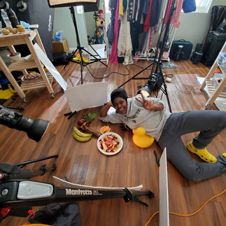
Yes, we had mood boards. Yes, we tested light angles like mad scientists. Yes, some of us stood on a chairs once or twice. Some of the best ideas came from off-script moments during the shoot. We also created extra test shots just for layout references — a few of those even made it onto the packaging.
📦 Some product images were used in the final packaging layout
🖨️ Others were printed for tabletop displays + point-of-sale
📱 And yes — I’ve included some iPhone BTS to show how we made the magic
💬 Want This for Your Brand?
If you're ready for scroll-stopping product photos that actually convert — let’s talk.


Comments